
Client
We had the privilege of shaping the brand refresh for beachvolley.wien, developing a logo redesign that seamlessly blends the essence of beach life, friendship, and escape with athletic professionalism—while ensuring impactful brand communication. This fresh approach is evident right from the naming: Beachvolley Wien has become beachvolley.wien!
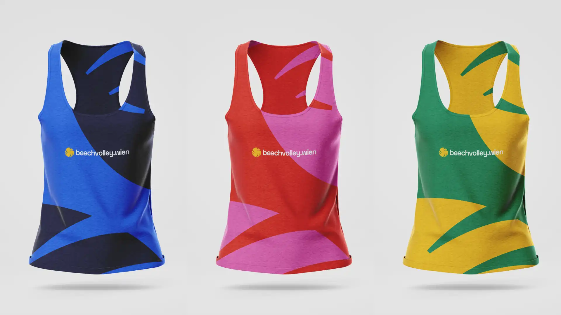
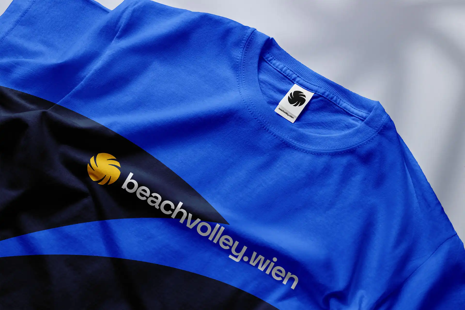
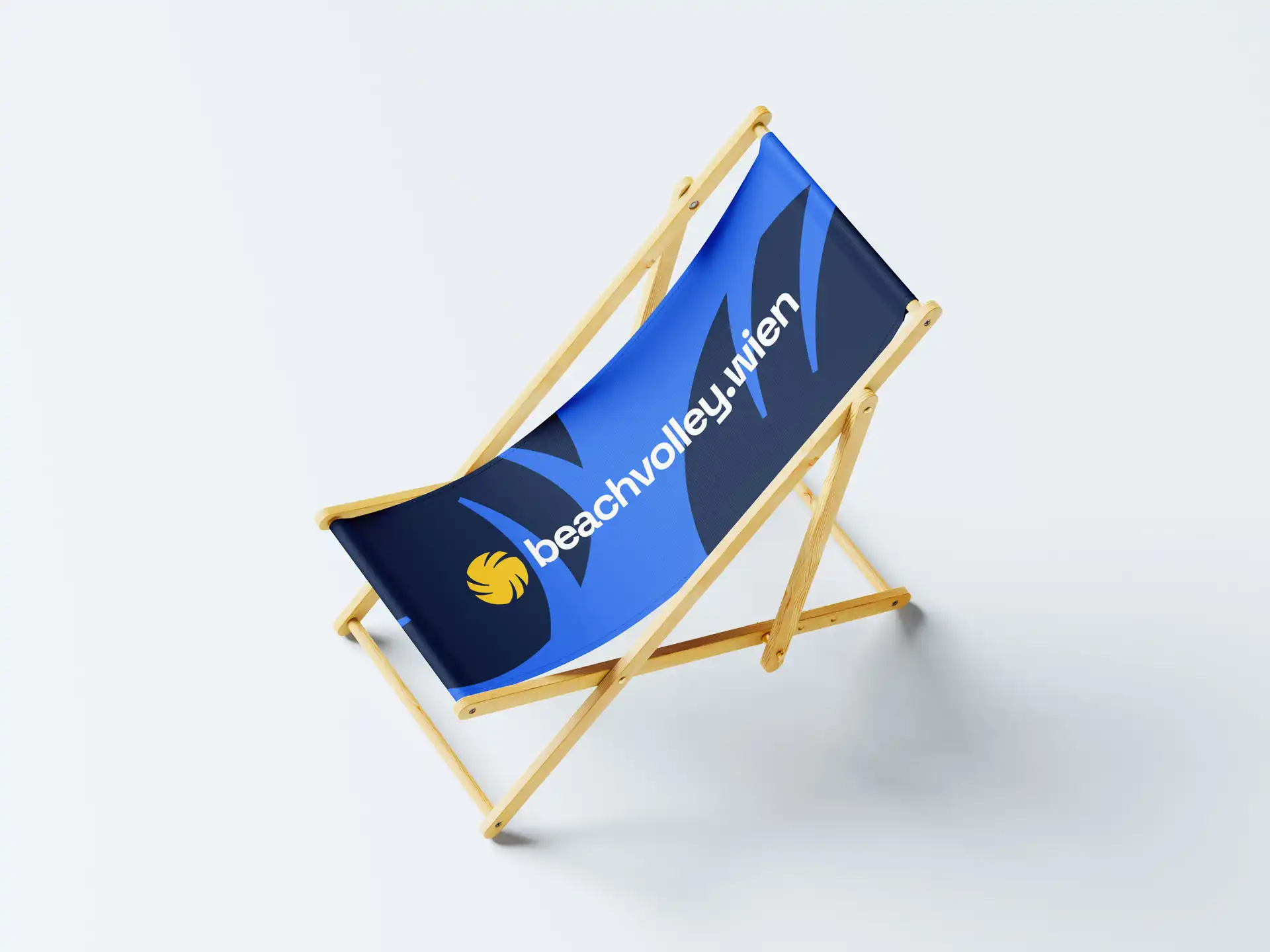
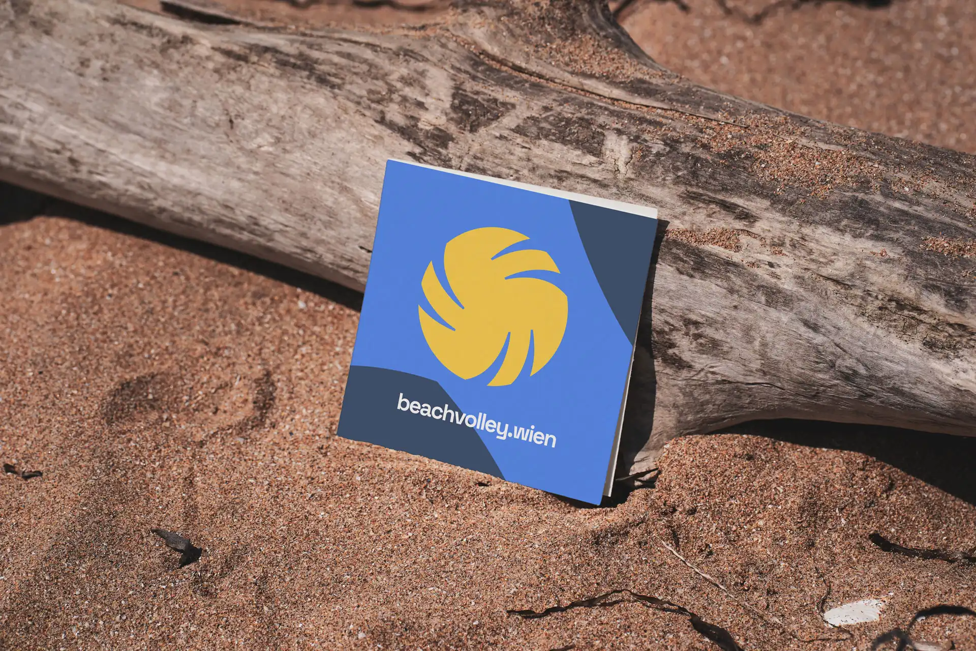
The redesign builds on the existing branding, allowing for a smooth transition between previous and newly created marketing and branding materials. At the heart of the corporate design is the beach volleyball itself—its refined form adds layers of meaning, symbolizing dynamism, sunlight, and nature. The color palette pays tribute to the iconic birthplaces of beach volleyball: Hawaii, Copacabana, and the Côte d’Azur.

Book your free consultation meeting now